

- LIFE
100 Encouraging Bible Verses About Friendship and Love


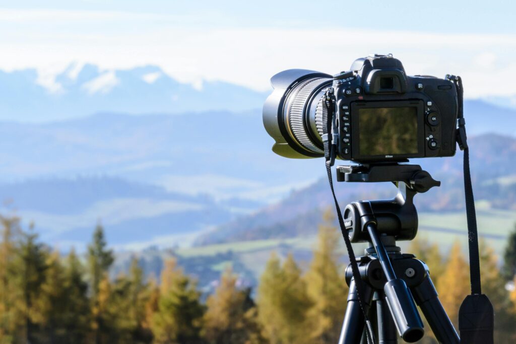
Photography is as much about how you see as it is about what you capture. One of the simplest yet most powerful tools for shaping your vision is the Rule of Thirds. This composition technique can instantly transform a dull snapshot into an engaging image that feels balanced, natural, and dynamic. In this article, we’ll explore what the Rule of Thirds is, look at how it works through different kinds of photographs, and then dive into why it’s useful and how you can start applying it in your own work.

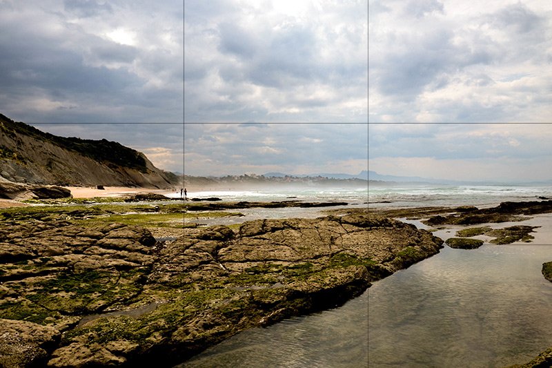
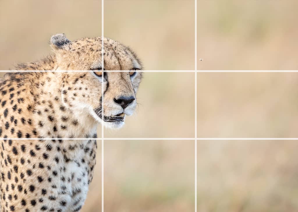
Imagine dividing your frame into nine equal sections by drawing two equally spaced horizontal lines and two equally spaced vertical lines like a tic-tac-toe grid. The Rule of Thirds suggests that the most important parts of your photo (the subject, horizon, eyes, etc.) should be placed along these lines or where they intersect.
Why? Because our eyes are naturally drawn to these off-center points. A centered subject can feel static or flat, while off-center placement adds balance and movement, guiding the viewer’s gaze more dynamically.
The Rule of Thirds is useful because it matches the way our eyes naturally take in a scene. When we look at an image, our gaze doesn’t just lock onto the very center—we tend to explore, moving around to find balance and points of interest.
By placing the subject slightly off-center, the photo feels more natural and less stiff. It creates a comfortable relationship between the subject and the background, adding a sense of energy and movement. For photographers, especially beginners, this rule works like a shortcut—it takes the guesswork out of composition and gives you a simple framework to make your photos instantly look more engaging without having to overthink every detail.
Imagine photographing a beach at sunset. If you place the horizon line right in the middle of the frame, the photo may feel flat—half sky, half sand, without a clear point of emphasis. But if you shift the horizon to the lower third, the sky suddenly dominates the image, allowing the colors of the sunset to shine. If you lower the horizon to the bottom third, the shoreline becomes the star, highlighting ripples in the sand and waves on the water. That simple shift transforms the picture.
Portraits benefit from this rule as well. A centered face can look stiff, almost like an ID photo. By placing the subject’s eyes along the top horizontal line, slightly to the left or right, the image instantly feels more alive and personal. It works even better if the person is looking toward the open space of the frame—the empty area balances the portrait and gives the viewer a sense of direction and context.
Wildlife and action shots also gain energy from the Rule of Thirds. A bird flying through the air looks static if centered. Move it to one third of the frame, however, and leave open space ahead of it, and the photo suddenly tells a story. The bird isn’t just hovering in place—it’s soaring into the open sky, and that negative space adds anticipation. Similarly, a running animal or a racing car placed off-center feels like it’s in motion, heading toward something beyond the frame.
Even still life and food photography benefit from the grid. A coffee mug placed in the center of the table might look ordinary. Shift it to the bottom-right third, with blurred objects or textures filling the rest of the frame, and the image feels intentional and stylish. Food photographers often use this trick by placing the main dish off to the side and filling the empty space with props like ingredients or utensils, making the shot look more like a curated story than a quick snapshot.
Architecture can also be elevated using this rule. A tall building photographed dead center may appear rigid, while aligning it with a vertical third creates balance with the surrounding sky or cityscape. The structure feels part of its environment rather than isolated from it. Even when symmetry is the main focus, many photographers subtly use the thirds grid to add contrast or direct attention to specific details.
Most cameras and smartphones allow you to turn on gridlines in the viewfinder—this is the easiest way to start. Practice by photographing simple subjects, such as a flower, a person, or a cup of coffee, and experiment with placing them on different intersections. In landscapes, decide whether the sky or ground is more interesting and place the horizon along the top or bottom third. In portraits, line up the subject’s eyes with the top third for a more natural look. For action or wildlife, leave space in the direction of movement to create flow.
Over time, this practice will become second nature. You’ll start seeing the grid in your mind even without the camera overlay, and composing images will feel more intuitive. And once you’re confident, don’t be afraid to break the rule. Centered symmetry, minimalist compositions, or creative framing can all work beautifully when done intentionally. The key is to master the rule first so that when you choose to break it, your photos are bold and purposeful rather than accidental.
Hope this guide helps you see your shots in a new way and inspires you to experiment with composition the next time you pick up your camera! 📸